

Behind the design
Every project begins with a problem worth solving. This case study explores the thinking behind our design decisions—from identifying user experience challenges to creating purposeful solutions that support business goals.
Featured Case Study
Hovy Skin
Skincare brand redesigned to create a stronger first impression, improve clarity, and drive action.

The Problem
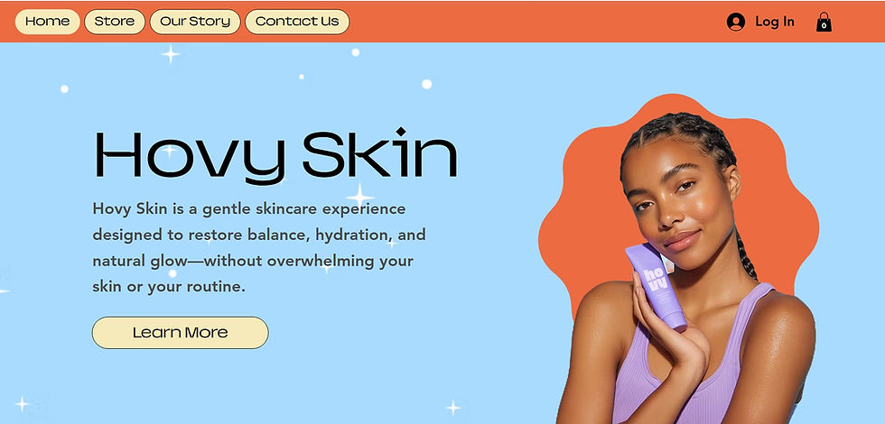
The original hero section introduced the brand, but didn't clearly communicate what Hovy Skin offers or guide visitors toward taking action.
The Approach
I restructured the layout to create a clear visual hierarchy, highlight the brand's value, and introduce a strong call to action that encourages engagement.
The Result
The redesign shifts the hero from an informational introduction to a conversion-focused entry point by clearly communicating the brand, establishing trust, and directing visitors toward their next step.
.jpeg)
Original Hero Section
Clean but lacked clear message, hierarchy, and a strong call to action.
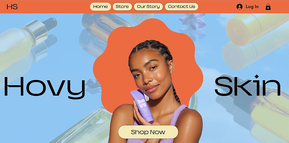
Redesigned Hero Section
Clear messaging , stronger hierarchy, and a focused call to action.